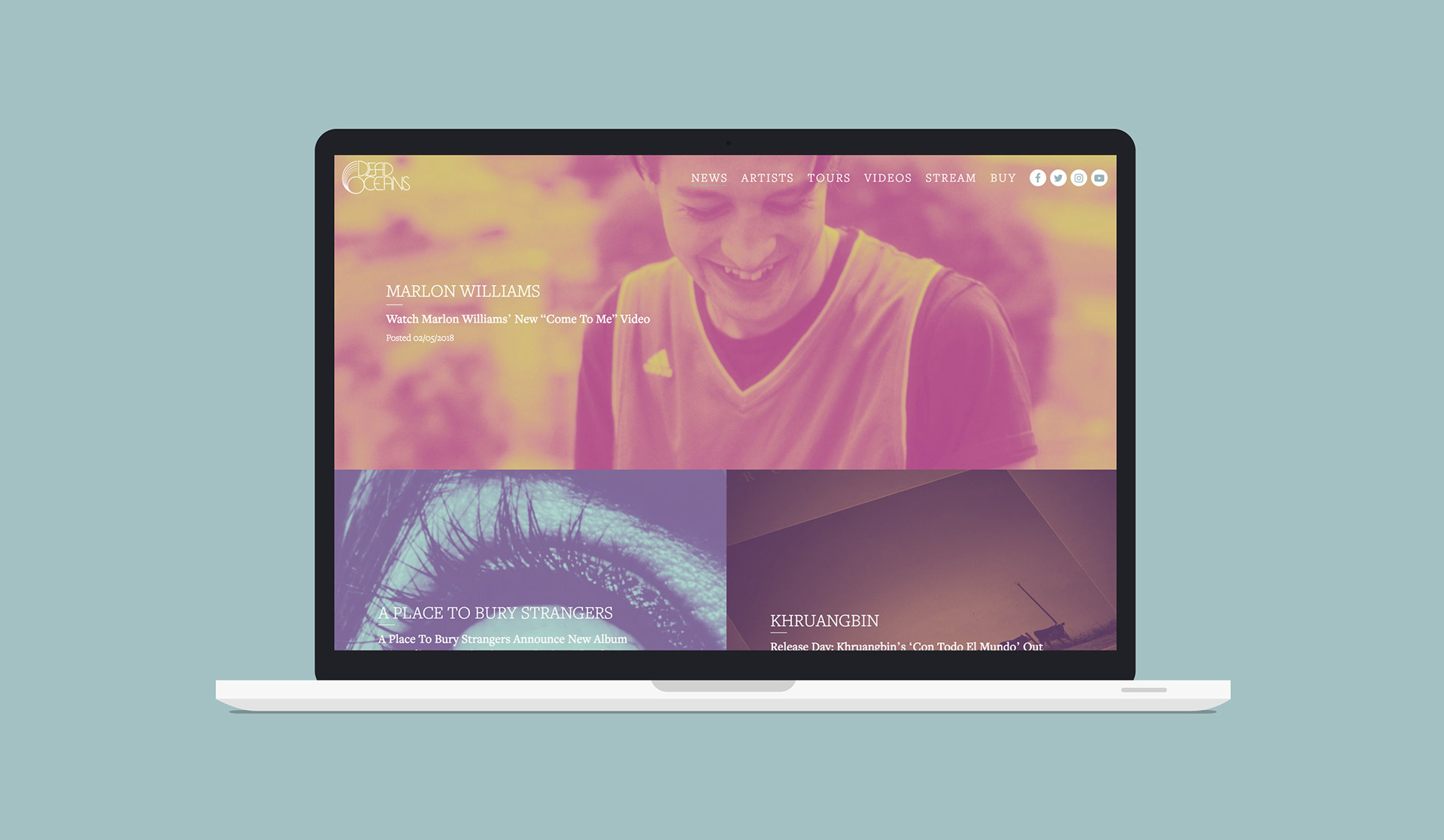
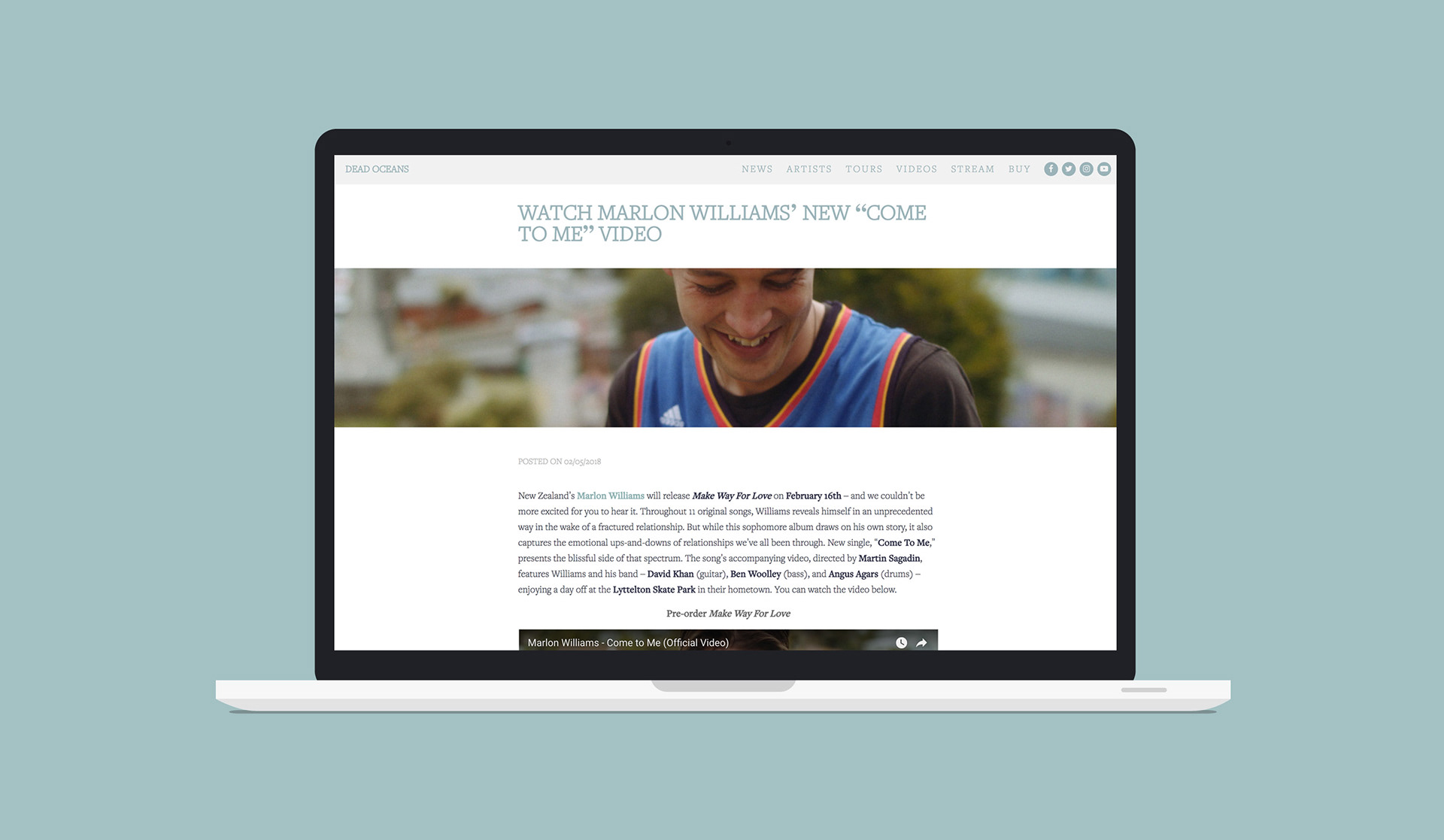
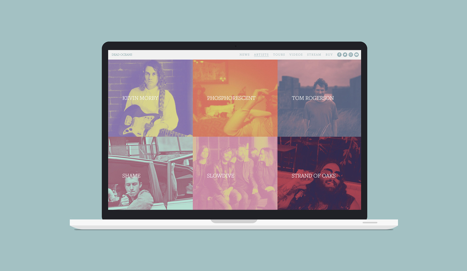
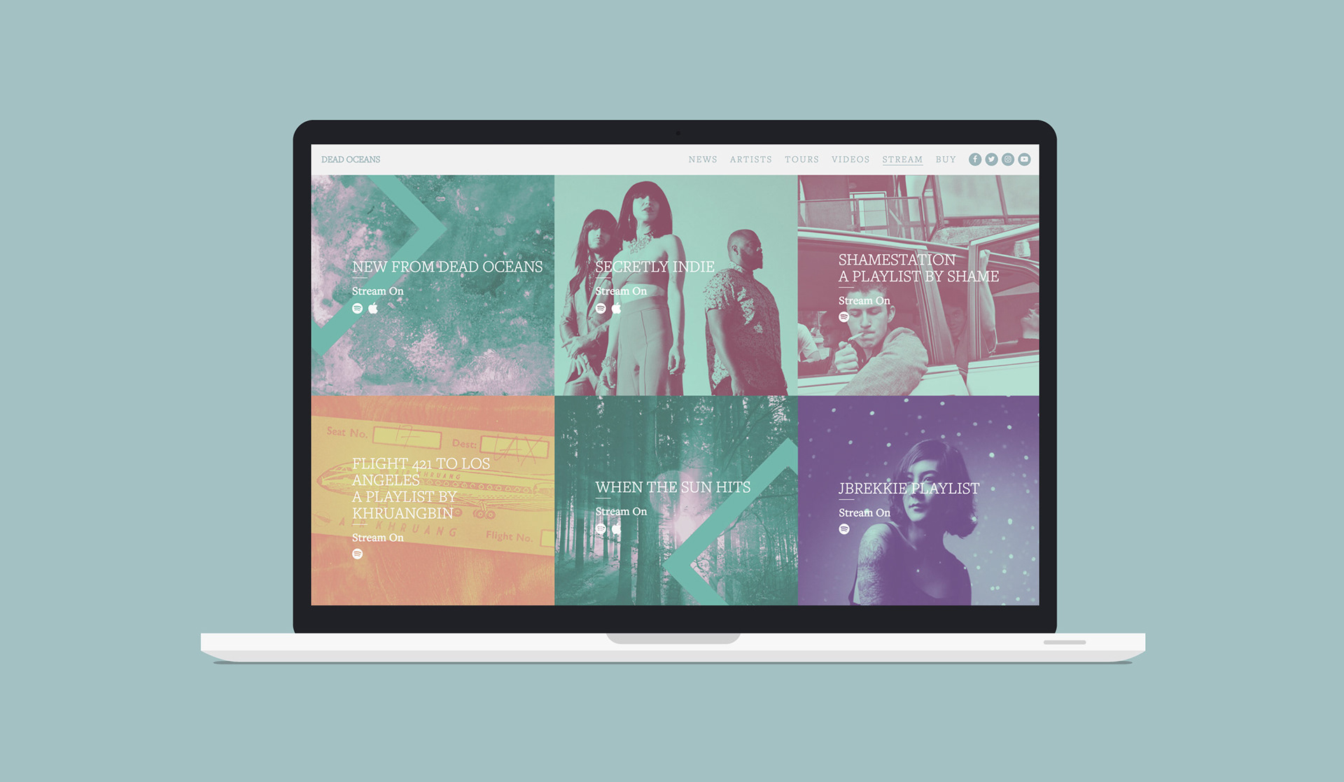
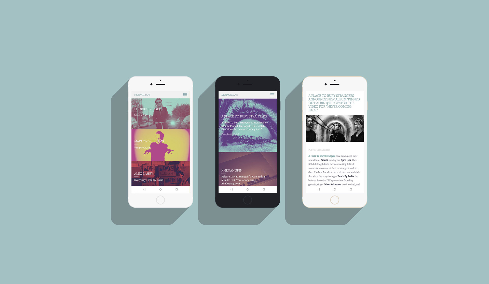
The aim of the project was to deliver a more feed orientated presentation of the content whilst increasing the label's identity via color, typography and image treatment.

Visit Dead Oceans here
A complete reworking of the Austin based label's website.